Alexander von Ness - September 5, 2025
Book Cover Design Awards – September 2025
Welcome to the Book Cover Design Awards by Self-Publishing and Book Marketing Blog.
Judge: Alexander von Ness
Alexander is a book cover designer with almost thirty years of professional experience in graphic design, including over a decade as an art director in a branding agency. His website and blog are among the top trusted sites for book cover design services overall and have been selected as one of the 100 Best Websites for Writers.

The winner of this month’s
Book Cover Design Awards is
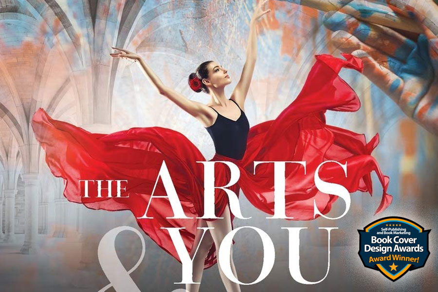
Becky Bayne

Designer: Becky Bayne
Book Title: The Arts & You
Submitted by: Becky Bayne
Book description: The Arts & You has more than a thousand quotations of artists and art critics, compiled from journal articles and books of the last two hundred years, on painting, sculpture, photography, garden arts, architecture, poetry, music, dance, theater, and literature.
Alexander von Ness: This is an exceptionally beautiful and impactful cover design. As a professional book cover designer, I can admit it inspires a healthy sense of envy. The author is truly fortunate to have such a powerful and captivating design representing his work. Without question, one of the most remarkable covers I’ve encountered recently.
-

Designer: Grzegorz Japol
Book Title: Desperate Measures
Submitted by: Grzegorz JapolBook description: The Amazon emitted more CO2 than it absorbed. This quote starts the book dedicated to the Amazon. We wanted to show the heroine of the book as well as the fire.
Alexander von Ness: Excellent cover. The red ‘menacing’ hand is a strong focal point, and together with the plume, it creates an excellent composition. If I were designing this cover, I would double the size of the Indian woman, let the plume extend beyond the cover, and make the hand even larger and more central. I would place the author’s name at the bottom and the subtitle at the top. Perhaps this is subjective, but I think that would make an outstanding cover.
Gold-starred cover design. -
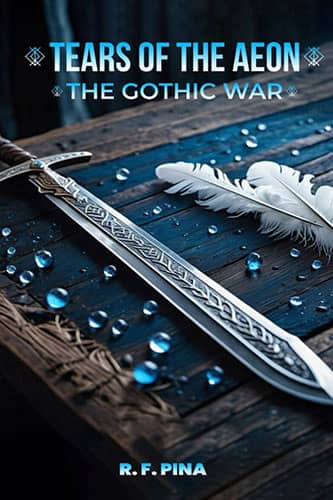
Designer: The Ghost Writing Club
Book Title: Tears of the Aeon: The Gothic War
Submitted by: Ruddy PinaBook description: The book cover directly depicts the sword of the warrior, the main character of the story. He is this supernatural being who comes from another realm to study humans behavior, culture, and emotions. The two feathers on the book cover represent the feathers of the main character; he flies on wings of feathers.
Alexander von Ness: The idea of combining the sword and feathers is excellent, but in my opinion, the execution is somewhat problematic. I think the focus on the sword has been handled incorrectly. I would place the tip of the sword at the center of the cover, making the blade’s point the main focal element. That would place stronger emphasis on the symbolic association the sword represents. As it stands, it looks more like a sword being sold on Amazon. I don’t mean this in a negative way—my intention is constructive, so other authors can learn where cover design choices might go wrong. Also, the title, subtitle, and author name are very poorly executed and definitely need improvement. Otherwise, the concept itself is gerat.
-

Designer: Lizbe Coetzee
Book Title: This is How We Heal from Painful Childhoods
Submitted by: Ernest EllenderBook description: Healing from childhood trauma is an extremely complex and daunting process, so I wanted the book cover to inspire hope in its picture of a happy couple who created a bubble of safety in spite of still having demons from their past trying to get in.
Alexander von Ness: This cover instantly communicates its self-help genre, which is a strong and effective starting point. However, the author’s name is rendered far too small, diminishing its presence. The choice of black for the title undermines the message of hope that is central to this genre, instead creating a more somber and even depressing tone. The imagery could also benefit from greater emphasis—the central photo nearly doubled in size would heighten the contrast between the joyful couple in color and the darker, demonic figure in the background. The concept itself is very good, but the execution lacks refinement. With adjustments, this idea could achieve far stronger impact.
-

Designer: Danielle Camorlinga
Book Title: 100 Livestreaming & Digital Media Predictions
Submitted by: Ross BrandBook description: The predictions started in 2016 as an annual blog post aimed at industry insiders and early adopters. In 2021, Ross Brand published the predictions in book form to benefit people well beyond the online media industry as the pandemic made employing digital tools a business necessity.
Alexander von Ness: The typography here is strong and demonstrates a clear attention to detail, which deserves recognition. Where the design falls short is in the choice of background. The solid black feels overly somber and risks sending a message of despair rather than optimism. For a book that, even in the context of the pandemic, seeks to provide guidance and predictions toward a brighter future, the cover should visually echo that sense of hope. While the typography works beautifully, the background color needs reconsideration—something lighter or more uplifting would better align the design with the book’s intended message.
-
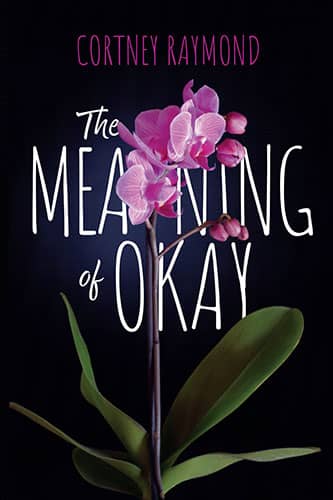
Designer: Bookbaby
Book Title: The Meaning of Okay
Submitted by: Cortney RaymondBook description: There's a scene where the main character is given an orchid, and she holds it for comfort after an unpleasant interaction with her parents.
Alexander von Ness: This is a strong and appealing cover overall, with only a few elements holding it back. The author’s name is rendered too dark and would stand out far more effectively in white. The background, too, feels overly heavy; lightening it would bring greater balance and warmth. Enhancing the greenery of the leaves would further contribute to an inviting and vibrant appearance. With these adjustments, the design would achieve a more polished and compelling impact.
-
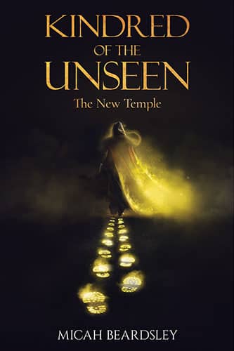
Designer: Thejan
Book Title: Kindred of the Unseen
Submitted by: Micah BeardsleyBook description: The Kindred of the Unseen are called to rise. From the realms of the spirit these sons and daughters of the light are beckoned from their slumber to awaken and discover their yet unknown spiritual inheritance, the destinies and realities of the supernatural – the unseen worlds around them – realities that have been all but lost to their physical, natural comprehension.
Alexander von Ness: The central character should be much, much larger to be recognizable. As it stands, it looks like something unidentifiable in the distance. Three or four footprints would have been enough. It’s a real pity, because when the cover is enlarged, the illustration is beautiful. It feels wasted being ‘hidden’ like this. In my view, the opposite approach is needed—make the main figure as large as possible and place the focus there. With just a little work on the typography, this could be a perfect cover.
-

Designer: Kristi Griffith
Book Title: The Business Artist
Submitted by: Adam BoggsBook description: This book is about bringing your unique artistry into the business world. As such, the cover illustrates a clean separation between the two worlds, with Business on the left (graph paper, serif font) on the left, and illustrated artistic font on the right with brush strokes, capturing the duality of both business and art.
Alexander von Ness: I appreciate the originality of the idea, but the execution is very poor. I apologize for saying this, but since this is about art, there should have been a much greater contrast between the two worlds. (You know that story about the left and right sides of the brain!) - I don’t understand why, if the author wanted to emphasize the difference between the business world and the world of art, the right side representing art wasn’t rendered in such vibrant colors that it would ‘knock out’ the viewer. As it is, the designer simply turned a serif font into an ‘artsy’ font. It’s a real pity, because the concept is excellent and holds so much potential—a skilled designer would have enjoyed creating this cover.
-

Designer: Grzegorz Japol
Book Title: Far Better Money MANAGEMENT
Submitted by: Grzegorz JapolBook description: The cover was designed to be professional, elegant, and aesthetically pleasing. It primarily features classic serif typography, accompanied by a small image symbolizing money management, depicting a nurturing seedling that is flourishing with money.
Alexander von Ness: I’m not quite sure what to think about this design. It’s good, but there’s also a lot of room for improvement. First of all, I don’t like the image used. The stock photos chosen feel outdated—like something seen repeatedly over the past decade—and come across as somewhat generic. While I believe quotes from famous figures can work on a cover if necessary, here they feel overcrowded, making the book title appear ‘cramped’ and lacking proper breathing space. I may be nitpicking a little, but the difference between a good design and an excellent one often lies in these small details.
-
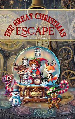
Designer: Janae Haddad
Book Title: The Great Christmas Escape
Submitted by: Janae HaddadBook description: The Great Christmas Escape, a whimsical chapter book for kids ages 7-12 that bursts with festive fun! Felix the Fox, Beatrix the Bunny, and Oliver the Owl are suddenly trapped in a magical snow globe when a mysterious mist sweeps through Evergreen Hollow. To save their Christmas, they must embark on a wild quest to escape!
Alexander von Ness: A very striking illustration—charming and positive. The idea of placing the author’s name on the sign is excellent, though it’s a bit too small to read easily. I really like the concept. I’m not happy with the title at all. Instead of the black outline, it should have been white. Also, ‘The Great’ should be separated from ‘Christmas,’ with each word on its own line, so the title could be much larger, which is desirable. The white transparent background under the title is unnecessary—it only confuses and covers the beautiful illustration. Removing that transparent background and moving the illustration downward would create more space for the title, making the bell and clock in the background clearly visible, which would greatly enhance the appeal of this charming cover.
-

Designer: Kerri Lane Mariano
Book Title: The Gingerbread Games
Submitted by: Kerri Lane MarianoBook description: The cover of The Gingerbread Games perfectly captures the playful, romantic spirit of this holiday rom-com set in a charming small town in Virginia. Against a snowy backdrop, a cozy couple shares a whimsical, affectionate moment, hinting at the warmth, rivalry, and festive cheer within.
Alexander von Ness: This brown-red border is completely unnecessary. I don’t see any purpose for it. In non-fiction books, a border is sometimes used to separate the thumbnail cover from the white background on Amazon, which is often the reason authors add it. One of the biggest ‘sins’ in book cover design is using too many different fonts, and here, with such little text, there are four different fonts. I don’t want to be overly critical, but this cover has potential—if the typography were simplified, the playful couple were enlarged and put in focus, and the image tones adjusted, this could become an outstanding cover.
-
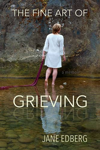
Designer: Jane Edberg
Book Title: The Fine Art of Grieving
Submitted by: Jane EdbergBook description: "The Fine Art of Grieving" is an art illuminated memoir about an unconventional path through grief using art to process loss after the death of my son. The image on the cover is of me with my son's blanket, a performative artwork about staying fluid within grief as I symbolically offer his blanket into an inlet to the ocean where my son's ashes were released. The book starts with the cover, a mysterious symbolic scene and ends with two more images from the same location, one with the blanket falling from my mouth, and the last one where the blanket comes from between my legs into the water, looking like blood flowing.
Alexander von Ness: I know I probably shouldn’t say this, but when I read the book description, I was moved to tears. Considering this is a very sensitive topic and that the author designed this cover herself, this cover is beyond normal commentary. As a book cover designer, I believe the typography definitely needs to be improved.
-
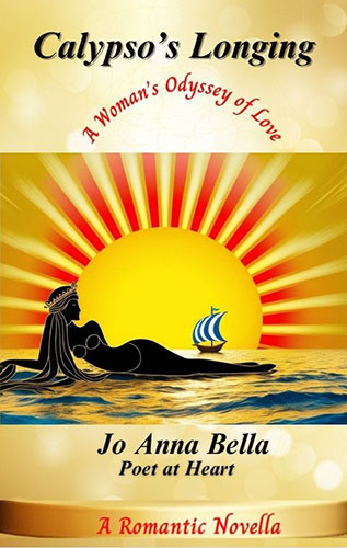
Designer: Jo Anna Bella Bennerson
Book Title: Calypso's Longing, A Woman's Odyssey of Love
Submitted by: Jo Anna BellaBook description: I build the cover using Canva.
Alexander von Ness: I’ll be very frank. Very bad! I could write an entire blog post about everything that’s wrong with this cover. First, I don’t understand why the cover is ‘divided’ into three parts. Then it’s further divided into five sections, with a completely wrong hierarchy of information. This is one of the covers that do more harm than good to this book. A full redesign is absolutely necessary!
-
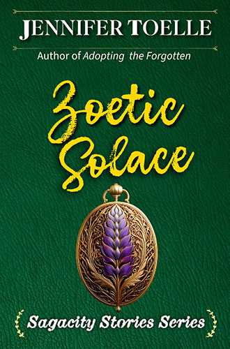
Designer: Jennifer Toelle
Book Title: Zoetic Solace
Submitted by: Jennifer ToelleBook description: Author Jennifer Toelle is also the owner of Janine Chellington Press. The author designed her own cover.
Alexander von Ness: Again, a ‘deadly sin’ of book cover design: four different fonts on such a small amount of text. From the author’s description submitted for this entry, I don’t understand anything, and as a cover, it communicates absolutely nothing. I don’t even know how to comment on this design—like soup without salt.
-
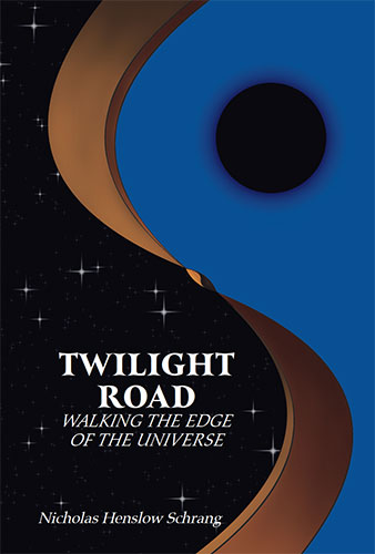
Designer: Nicholas Henslow Schrang
Book Title: Twilight Road: Walking the Edge of the Universe
Submitted by: Nicholas Henslow SchrangBook description: Twilight Road is a philosophical fiction which delves into themes of understanding death, meaning in life, and making sense of the universe when tossed in the thick of the unknown.
Alexander von Ness: Ufff… heavy topic. I’ll try to be gentle. This cover looks like it was made in PowerPoint. Considering the weight of the subject and the fact that it’s fiction, I think the potential wasn’t fully utilized. There’s a lot of room for improvement here, and I recommend a complete redesign of this cover.
-
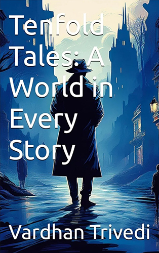
Designer: Vardhan Trivedi
Book Title: Tenfold Tales: A World in Every Story
Submitted by: Vardhan TrivediBook description: A mystery detective standing a deadly city of crimes where here is trying to search for clues.
Alexander von Ness: I’ll be very frank again. I also use AI to enhance my designs or create elements that are missing, but creating a background in an AI generator and simply typing the text over it is unacceptable to me. In short, the title is very poorly executed, and I think some real effort should be put into it.
-
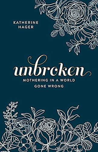
Designer: Becky Bayne
Book Title: Unbroken; Mothering in a World Gone Wrong
Submitted by: Katherine HagerBook description: This cover is meant to engage the reader on a more somber topic with a whimsical floral cover. The color palette is simple so as not to be a distraction with the overall look of a classic work, especially apparent when ordered in hardcover.
Alexander von Ness: I know many may not agree with me, but this is an excellent design! Admittedly, I would have added some color, but since the description notes that the color palette is intentionally simple to avoid distraction, I respect this design.
Gold-starred cover design. -
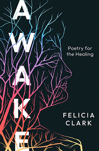
Designer: Kayla Lulloff
Book Title: AWAKE: Poetry for the Healing
Submitted by: Felicia ClarkBook description: The author's silhouette was used as the tree since the story is deeply personal to her. The branches grow around a background, which is dark and void, representing her struggles and trauma. However, layered on top of the dark is her healing—the branches—flowing through the colors of each stage of the author's life and healing journey.
Alexander von Ness: I wasn’t very impressed when I first saw this design, but when I visited the designer’s page and saw the cover’s "case study", I immediately changed my opinion. Very good design—Congratulations!
Gold-starred cover design. -
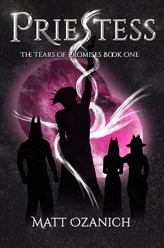
Designer: Matt Ozanich
Book Title: Priestess: The Tears of Promises Book One
Submitted by: Matt OzanichBook description: The characters in the book worship two moons, pictured in the background behind the antagonist, the High Priestess, as she casts her magic in front of the main characters. The intent was to showcase the beauty of the moons and the looming threat of the antagonist.
Alexander von Ness: Unfortunately, I don’t see the beauty of the two moons anywhere. If the author hadn’t mentioned it in the description, I wouldn’t have known what it’s about. (Why isn’t the moon yellow, if it’s a moon?) The characters in the background remind me of ancient Egyptian priests, so their silhouettes send the wrong message to me as a reader. As a designer, I absolutely don’t like the typography.
-

Designer: Jade Padlan
Book Title: Empowered Postpartum Wellness
Submitted by: Jade PadlanBook description: The watercolor design visually merges the emotional, physical, & spiritual layers of motherhood’s transformation. The image anchors the book’s core: healing the mother is the first step to healing future generations.
Alexander von Ness: A beautiful and positive book theme. I like the illustration and the colors. Very appropriate—actually, excellently executed. I think the subtitle is in the wrong place, and the heart was added just to fill space, which I consider a mistake. Every design should follow the principle of ‘less is more.’ - If the author really wanted the heart, it should have been incorporated into the title, and the purple ribbon under the author’s name is also unnecessary, as it distracts and disrupts the cover hierarchy. Overall, solid.
-
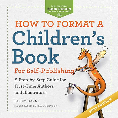
Designer: Becky Bayne
Book Title: How to Format a Children's Book for Self-Publishing
Submitted by: Becky BayneBook description: This book cover was intentionally designed to resemble a children's book, featuring bright colors and an accompanying illustration. As this is a how-to book, I wanted to give the readers; authors and illustrators, a clear idea of what a self-published book, using KDP services, would look like.
Alexander von Ness: When you read the book description, everything is crystal clear. There is absolutely nothing to add here. Excellent cover!
Gold-starred cover design. -
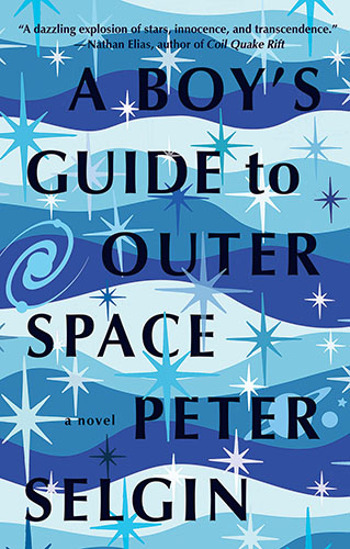
Designer: Peter Selgin
Book Title: A Boy's Guide to Outer Space
Submitted by: Peter SelginBook description: I am both an author and a graphic designer specializing in book cover design. The publisher of "A Boy's Guide" (Regal House Publishing) consented to my designing my own cover. I submitted a half-dozen different designs before the present cover was accepted.
Alexander von Ness: This might sound strange, but I don’t see anything particularly special in this cover. But that’s not the point at all. I looked at this designer’s portfolio. I don’t understand why he submitted this design to the competition when his portfolio contains so many outstanding works—half of which could easily win this contest. Peter, I publicly declare that you have so many beautiful designs that I’m not only impressed but also genuinely envious.
-

Designer: Alfie
Book Title: The Doctor's Future
Submitted by: Pietro Emanuele GarbelliBook description: The cover of my new book "The Doctor's Future" evolves from the cover of my first book "The Doctor's Voice": keeping consistency in the branding/series, it introduces new futuristic elements and represents the collaboration of AI and robotics with human doctors and other healthcare stakeholders, with humans at the helm of this revolution.
Alexander von Ness: Since the author already had a first book and this one naturally follows it, I think the work was done decently. I’ll repeat what I mentioned about another design in this competition: I consider the blue ribbon under the author’s name unnecessary, as it disrupts the hierarchy of the cover. I mention this as advice for all authors to avoid if possible. If they insist on keeping it, it should be much smaller, because here it unnecessarily occupies a large portion of the lower cover space, which could instead be used for a larger subtitle.
-

Designer: Lisa Fyfe
Book Title: Hope Dies Last
Submitted by: Burt WeissbourdBook description: Taut, timely, and relentlessly gripping, Hope Dies Last is a non-stop thriller that pits one family's courage against a global web of corruption.
Alexander von Ness: Good attempt. I see three elements incorporated into this cover: the city in the background, the flames, and the running man. While the idea is classic and has been seen many times before, the concept is acceptable. However, the execution of the title could have been much better. I may be repeating myself, but I cannot emphasize enough how important typography is in book cover design. The author’s name is almost invisible, and the subtitle is absolutely unacceptable in its current form.
-

Designer: Lisa Fyfe
Book Title: In Velvet
Submitted by: Burt WeissbourdBook description: Antlers are in velvet when blood is still flowing through them. That's before the horn growth is completed, usually June and July. During this time, the antlers are covered with what looks like brown fuzz. This fuzz is mostly dead cells called velvet. The velvet is like an outer skin. Underneath, the cell structure is still alive-blood flowing through a network of capillaries, a living nerve system, calcification, and so on. Apparently, if the blood can be sealed in the velvet antler the aphrodisiac properties improve.
Alexander von Ness: This cover design, like the previous one from the same designer, suffers from the same basic mistakes. Personally, I think the subtitle is unnecessarily long, and the shadow of the deer is completely unnecessary and very poorly executed. I assume the designer has learned some Photoshop basics and is currently experimenting with creating covers.
We hope you learn something new about what works and what doesn’t work in this book cover design awards contest and that it will help you correct any omissions and improve your book cover.
Remember, a good book cover design is the best marketing tool you have to sell your book, and don’t get it wrong right from the start.
Award winners and Gold-Starred covers win the right to display our badges on their websites.
The deadline for the next submissions is December 31, 2025.
Click here to submit your e-book cover.
The original announcement post.
Book Cover Design Awards, February 2024
Book Cover Design Awards, August 2022
Book Cover Design Awards, January 2022
Book Cover Design Awards, November 2021
Book Cover Design Awards, October 2021
Book Cover Design Awards, September 2021
Amazon, Blog, Book Cover Design Awards, Book Marketing, Self-Publishing,