Alexander von Ness - August 4, 2022
Book Cover Design Awards – August 2022
Welcome to the Book Cover Design Awards by Self-Publishing and Book Marketing Blog.
We received 28 covers.
Judge: Alexander von Ness
Alexander is a book cover designer with almost thirty years of professional experience in graphic design, including over a decade as an art director in a branding agency. His website is among the top trusted sites for book cover design services overall and this Self-Publishing and Book Marketing Blog has been selected as one of the 100 Best Websites for Writers.

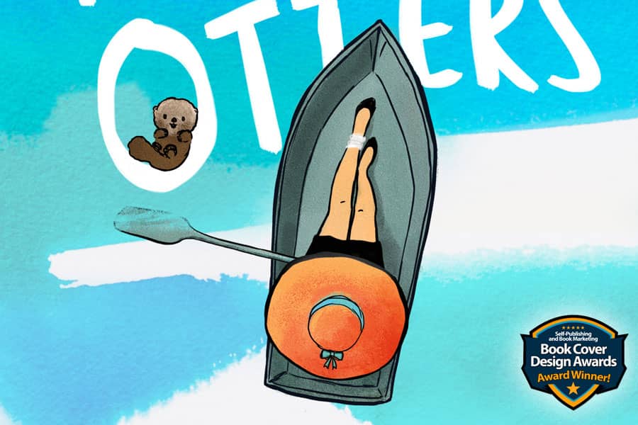
The winner of this month’s
Book Cover Design Awards is
Ana Grigoriu-Voicu
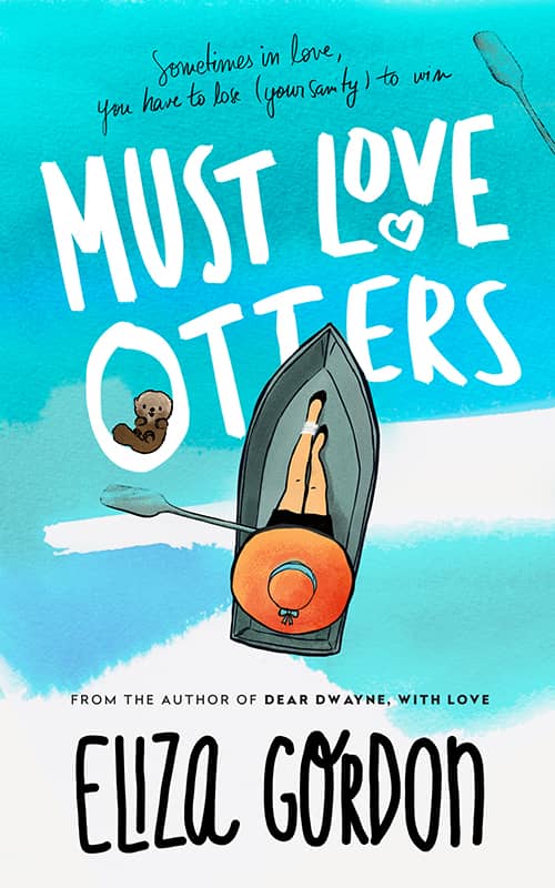
Designer: Ana Grigoriu-Voicu
Book Title: Must Love Otters
Submitted by: Ana Grigoriu-Voicu
Book description: Eliza Gordon's first book in the Revelation Cove series, "Must Love Otters" features a digitally painted scene as well as custom hand lettering in the title and author name.
Alexander von Ness: An excellent cover design that was made according to all the rules of the book cover design profession. Color composition, typography, balance and, above all, simplicity, are the characteristics that adorn this wonderful cover design. Really great cover!
-

Designer: Milo from Deranged Doctor Design
Book Title: Zpocalypto: Every Dead Player
Submitted by: Darja Deranged DoctorBook description: That moment when you learn the dead aren't the only ones who want you to join their ranks. Episode 06 ratchets up the tension, the terror, and the gore in this relaunch of Saul Tanpepper's popular cyberpunk zombie apocalypse series GAMELAND.
Alexander von Ness: Excellent cover design. Tonality and composition complement each other exactly as they should. The colors are balanced and the whole design is suitable for the target audience.
Gold-starred cover design. -

Designer: Milo from Deranged Doctor Design
Book Title: Zpocalypto: Jacker's Exploit
Submitted by: Darja Deranged DoctorBook description: Welcome to the World of Gameland, a live-action virtual reality arcade situated in the middle of a post-outbreak Long Island and home to the Reanimated.
Alexander von Ness: All the same as for the previous design. ;)
-

Designer: Dragana from Deranged Doctor Design
Book Title: Purged In Fire
Submitted by: Darja Deranged DoctorBook description: An ancient prophecy presents a daunting challenge for predestined couple, Alexander and Bronwyn. While Roderick and Maeve struggle to find their footing in a world five hundred years from when they began.
Alexander von Ness: A standard design made for the target audience. This design met expectations.
Gold-starred cover design. -
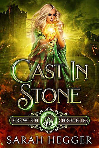
Designer: Dragana from Deranged Doctor Design
Book Title: Cast In Stone
Submitted by: Darja Deranged DoctorBook description: When witch-hunts, powerful arcane enemies, and unforgivable betrayal drive the coven to the edge of extinction, this young, inexperienced witch and her newly bonded warrior guardian are all that stand against the potential death of Cré-Magic. Unbeknownst to the two of them, their connection has been forged by the Goddess to face a challenge hundreds of years in the future—so somehow, they have to be enough.
Alexander von Ness: All the same as for the previous design. ;)
Gold-starred cover design. -

Designer: Milo from Deranged Doctor Design
Book Title: Shards of Venus
Submitted by: Darja Deranged DoctorBook description: Still reeling from the vicious murder of her best friend, Violet Chambers is haunted by the "faceless" man with the neck tattoo who kidnapped her. Trying to move on is a daily struggle for the girl who spent most of her life in foster care.
Alexander von Ness: The typography here is clumsily done. Especially the lower part where the title collides with elements in the background that are almost the same color as the letters. I think the typography is the weakest part of this design, and it should be much more striking.
-

Designer: Milo from Deranged Doctor Design
Book Title: Flames of Mars
Submitted by: Darja Deranged DoctorBook description: Shifting by the light of Mars. . .Shape-shifters exist and Violet now knows it. But her journey into the shifter world has only just begun. Violet thought she’d finally found her solace when her college friends took her into their remote community. . . yet Nathan’s betrayal is still soul-deep. She’s taking her new normal one day at a time. Until a group of shifters, who change by the light of Mars, brutally attack her home.
Alexander von Ness: All the same as for the previous design. ;)
-

Designer: Marushka from Deranged Doctor Design
Book Title: L'entremetteuse
Submitted by: Darja Deranged DoctorBook description: No description!
Alexander von Ness: Good design, but I don't understand why there is such a gap at the bottom of the cover. The title should go down and thus fill the gap, and at the same time the image would "open up" and increase the contrast between the title and the background.
-
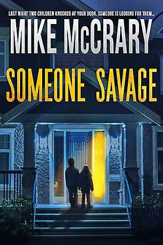
Designer: Kitten from Deranged Doctor Design
Book Title: Someone Savage
Submitted by: Darja Deranged DoctorBook description: A gripping, fast-paced thriller for fans of Harlan Coben, Karin Slaughter, and Rachel Abbott. Last night two children knocked at his door. Someone is looking for them… Nicholas Hooper wanted to be left alone. Looking to escape his past and his unfortunate present, the best-selling author rented a luxury house in the Poconos to finish what very well could be his very last book. But his plans change when one night he opens his front door to find two frightened children.
Alexander von Ness: Excellent design. Without a single mistake or remark. Well done, great job.
Gold-starred cover design. -

Designer: Bill Thompson
Book Title: Wounded Workers
Submitted by: Dr. Bob LarsenBook description: Wounded Workers honors America's workers. My book tells tales of trauma, sacrifice & resilience.
Alexander von Ness: I think this book cover needs a complete redesign. Generic cliparts are unacceptable and on this cover they even look repulsive. The choice of colors is wrong. The black frame is unnecessary and redundant. In any case, I suggest making a new cover. This kind of design can only harm the sales of the book.
-
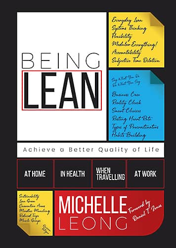
Designer: Out of Box Designs
Book Title: Being Lean. Achieve a Better Quality of Life At Home, In Health, When Travelling & At Work
Submitted by: Michelle LeongBook description: Design follows the Lean ethos of modular & segmentation for flexibility. It represents outside the box thinking solutions but achievable "oxymoron" of standardised customisation to achieve customer satisfaction. Visual mgmt is applied through colours, keywords plus the stationary theme.
Alexander von Ness: Clever concept and good idea. The only thing I personally don't like is the black background. I would try to change that.
-

Designer: Juan Roberts
Book Title: You're in America, now what?- 7 skills to Integrate with Ease & Joy
Submitted by: Senait PiccigalloBook description: The design reflects the diversity of the USA that I talk about my book.
Alexander von Ness: The idea is fine, but it was all done a little clumsily. Legibility is very poor due to the small contrast between the gold background and the white letters. I would definitely emphasize the American identity much more! It is necessary to work on the typography a little more.
-
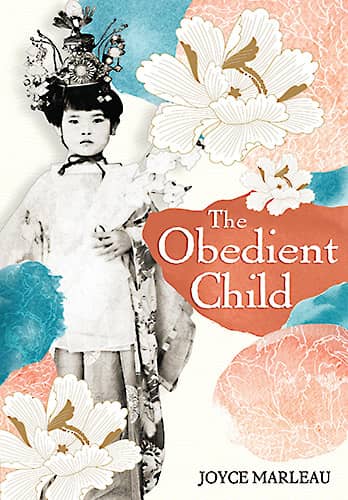
Designer: Jamie Tipton
Book Title: The Obedient Child
Submitted by: Ella RitchieBook description: The book is about a woman born under the Japanese occupation of Taiwan in 1933. Having lived through the Japanese occupation of her country, the second World War, and then Chinese government rule, she was no stranger to change.
Alexander von Ness: I really like this cover design. I think it lacks a bit of the "Japanese touch" in typography. In any case, a very nice cover.
Gold-starred cover design. -

Designer: Maria Miranda
Book Title: White Gloves
Submitted by: Karen WarfieldBook description: The cover reflects the historical setting and the dress of the day. Interestingly this woman, of obvious social status, is not wearing a pair of white gloves but rather shows her hands to the public. There is a moral reason behind this that reader will found out.
Alexander von Ness: Quite simple and "ordinary" design for an obviously interesting story. From the description of the book, I can see that the plot is very interesting and the message sent to the readers is strong. I think that it could have been used much better and with some clever detail, this cover could have been made much stronger.
-

Designer: Laura Bemis
Book Title: The Keeping House
Submitted by: Meredith KazerBook description: Young widow Lauren Serra purchases a deteriorating nineteenth century Queen Anne Victorian, in hopes that it might be the solution to the financial problems left by her recently deceased husband. Once she and her mother move in, they begin to uncover clues to the home’s tragic family secrets, hidden for almost a century.
Alexander von Ness: This cover is cluttered, with no hierarchy and with poor typography. I looked at the reviews on Amazon and it seems like a good book. I think that the redesign of this cover would improve the sales of the book.
-

Designer: Laura Bemis
Book Title: Ring Road
Submitted by: Meredith KazerBook description: Smart and confident, Lauren Serra is impatient to move into her new home. Why wouldn’t she be? The eighteenth-century farmhouse holds over two hundred years of Ring Family history, including clues to the missing Ring ruby pendant. But Lauren wants more from the home than the mystery it promises.
Alexander von Ness: According to what I understood from the description of the book, this cover design is a complete failure. Sorry, but I don't know what else to say.
-

Designer: Opeyemi Ikuborije
Book Title: Dishonor Thy Father
Submitted by: Marilyn AndersonBook description: A beautiful surgeon, an obsessed detective, and the bizarre murder that sparks their passion combine in this multicultural mystery-thriller inspired by the real-life issue of honor killings. It boldly explores issues of ethnicity, sexism, and social mores in today's complex world.
Alexander von Ness: Decent design. I think the target audience will agree with me ;)
-
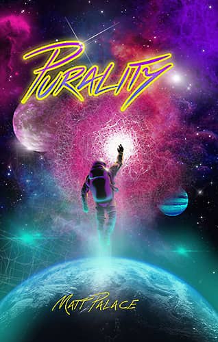
Designer: Dean Norman
Book Title: Purality
Submitted by: Galadriel Grace GraceBook description: Purality book cover is entirely created by Dean Norman and is original work. Dean Norman's website currently showcases his children's illustrations. submitted by Galadriel Grace – publishing company owner
Alexander von Ness: The illustration is very good, I really like it. However, the typography is very poorly executed. Everything looks unbalanced because neither the title nor the author's name are centered. If that could be fixed, this cover design would be phenomenal.
-
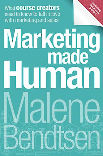
Designer: Diren Yardimli
Book Title: Marketing Made Human: What course creators need to know to fall in love with marketing and sales
Submitted by: Malene BendtsenBook description: I am a selfpublishing coach and this designer have created dozens of beautiful design for me. This book was recently republished with a new and more modern design and a subtitle that directly calls out the target audience.
Alexander von Ness: Very nice, decent and stable design. Simple and balanced. I like the background color.
Gold-starred cover design. -
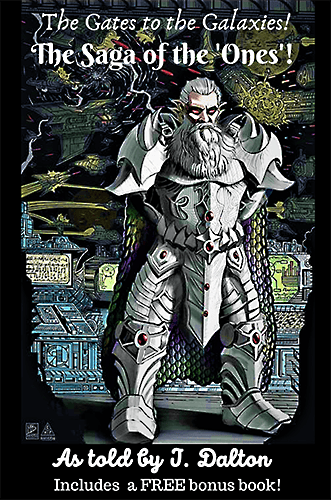
Designer: Matthew Bon
Book Title: The Saga of the Ones!
Submitted by: J. DaltonBook description: The cover design is of my villain, The Master. He was the ultimate leader of the "Ones". They are the direct descendants of the first race to explore the universe, and speak only in musical notes and psychic emotions.
Alexander von Ness: This illustration, which is not bad at all, could have been used much better. The typography must be changed because it "collides" with the entire design. It is necessary to completely change the look of the title and of course the font.
-

Designer: Milo from Deranged Doctor Design
Book Title: Lying in Ruins
Submitted by: Darja Deranged DoctorBook description: Book cover design for Lying in Ruins, by Jami Gray. Post-Apocalyptic cover design by Milo, Deranged Doctor Design.
Alexander von Ness: Everything is fine. I wouldn't change anything.
-

Designer: Kitten from Deranged Doctor Design
Book Title: The Donor
Submitted by: Darja Deranged DoctorBook description: Book cover design for The Donor, by JJ Burgess. Thriller cover design by Kitten, Deranged Doctor Design.
Alexander von Ness: Very good cover design. Really, great! Simple, striking, noticeable. This cover design has all the characteristics that improve book sales. I am sure that this design had an effect on better sales of the book.
Gold-starred cover design. -

Designer: Emily's World of Design
Book Title: The Bliss Drip
Submitted by: Emily's WorldBook description: The Bliss Drip is a paranormal romance RH romance. This means the main character will be romantically linked with multiple partners simultaneously. There is sexual content in this book that is consensual. One scene could be considered dubcon by some readers.
Alexander von Ness: It is necessary to work a little more on the typography and this cover design would be excellent. Even now as it is, it is good, but with improved typography it would be more than excellent.
-
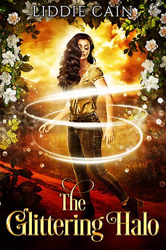
Designer: Emily's World of Design
Book Title: The Glittering Halo
Submitted by: Emily's WorldBook description: The world will just be a better place if we can get rid of one certain archdemoness. Our plans to move against her are going to take a drastic detour as an obvious vampire attack attracts the attention of the human police and the vampire Imperium. This means that Felix will need to lay low so the Imperium won't know he is free yet. I will race to find answers, along with Mac and Jason.
Alexander von Ness: All the same as for the previous design. ;)
-

Designer: Emily's World of Design
Book Title: On the Lam: Going Rogue
Submitted by: Emily's WorldBook description: The highly-acclaimed sequel to August Esquire's bestselling "On the Lam" brings you to four more memorable countries. From sacrificing animals in Mexico to frolicking with peckish deer in Japan, this second instalment will bring you to tears with true tales of travels gone away.
Alexander von Ness: I think the background color is not the best choice. Colors should be further dealt with and used to make this cover design much more attractive.
-

Designer: Sherilyn
Book Title: It’$ My Money..A guided journal to help you manage your finances
Submitted by: Patrina DixonBook description: It was important for me to be on the cover and be relaxed and related to the intended audience with are young adults.
Alexander von Ness: Considering the author's explanation and wish, I have nothing to add. If the author wanted it that way, then that's fine.
-

Designer: Al Esper
Book Title: Second Chances
Submitted by: Rita RealiBook description: The message is clear, but the design should be a little better. The image had to be "passed" through Photoshop filters, because this is how we see how both characters were inserted separately and merged into one image. With a little effort in Photoshop this could be made invisible.
Alexander von Ness: The message is clear, but design-wise it should be a little better. The image had to be "passed" through Photoshop filters, because this is how we see how both characters were inserted separately and merged into one image. With a little effort in Photoshop, this could be made to be imperceptible.
-

Designer: Alex Perkins
Book Title: Roswell: First Contact
Submitted by: Alex PerkinsBook description: This book cover was for a Sci-Fi story in the First Contact Sub Genre. I have produced another cover for the series which is yet to be published. Very nice and attractive cover design.
Alexander von Ness: Interesting and attractive cover design. In my opinion, the subtitle should be in white color for easy reading and better visibility. I wouldn't change anything, but if I had to, I would change the letters to tall and narrow ones so that they fill a big gap.
Gold-starred cover design.
We hope you learn something new about what works and what doesn’t work in this book cover design awards contest, and that it will help you correct any omissions and improve your book cover. Remember, a good book cover design is the best marketing tool you have to sell your book, and don’t get it wrong right from the start.
Award winners and Gold-Starred covers win the right to display our badges on their websites.
The deadline for the next submissions will be 30th December 2022.
Click here to submit your e-book cover.
Join the Self-Publishing and Book Marketing Group.
The original announcement post.
Book Cover Design Awards, January 2022
Book Cover Design Awards, November 2021
Book Cover Design Awards, October 2021
Book Cover Design Awards, September 2021
Book Cover Design Awards, Cover Design, Self-Publishing,