
Alexander von Ness - January 22, 2022
Book Cover Design Awards – January 2022
Welcome to the Book Cover Design Awards organized by The Self-Publishing and Book Marketing Blog.
Last month we received 31 covers.
Judge: Alexander von Ness
Alexander is a book cover designer with almost thirty years of professional experience in graphic design, including over a decade as an art director in a branding agency. His website is among the top trusted sites for book cover design services overall and this Self-Publishing and Book Marketing Blog has been selected as one of the 100 Best Websites for Writers.

The winner of this month’s
Book Cover Design Awards is
Milo from Deranged Doctor Design
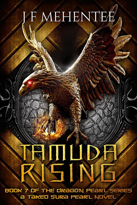
Designer: Milo from Deranged Doctor Design
Book Title: Tamuda Rising
Submitted by: Darja Deranged Doctor
Book description: The Tamuda nation gathers and prepares for war. The Takeo Sura, a cabal of disgruntled Dragons, is using deceit, cunning and murder to create chaos before the invading horde reaches the Imperial Fortress. While a desperate group of guardsmen try to hinder the Tamuda’s advance, the Fortress prepares for a siege. The Takeo Sura, however, have other ideas.
Alexander von Ness: Great cover design. Excellent tonality and perfectly balanced design. A dynamic and professionally designed book cover with strong design elements. A very appealing cover. Amazing job!
-
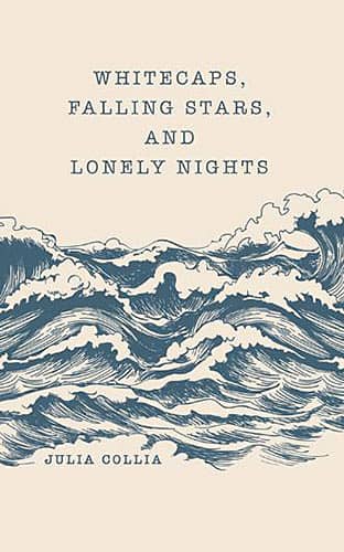
Designer: Archway Publishing
Book Title: Whitecaps, Falling Stars, and Lonely Nights
Submitted by: Julia ColliaBook description: My poetry book discusses topics that are difficult to get through mentally and emotionally. Most of my inspiration came from late nights by our local river or at our well-known beaches. The moon lit up the scene and the waves brought peace and serenity, similar to how writing made me feel.
Alexander von Ness: This cover has a lot of potential. I would suggest to emphasize the title and the author name a little bit more. The author name should be shifted down.
-
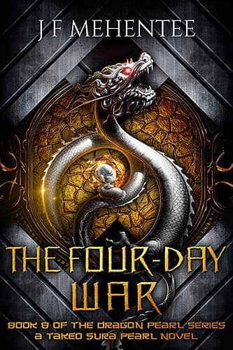
Designer: Milo from Deranged Doctor Design
Book Title: The Four-Day War
Submitted by: Darja Deranged DoctorBook description: Book cover design for The Four-Day War, by J F Mehentee. Epic Fantasy cover design by Milo, Deranged Doctor Design.
Alexander von Ness: Great cover design. Maybe the color of the title and subtitle should be changed to white in order to make the title more contrast and appealing.
Gold-starred cover design. -
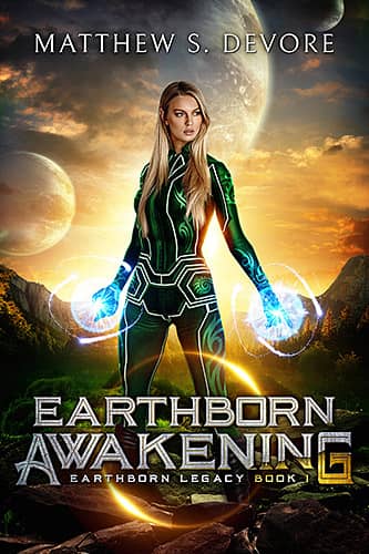
Designer: Milo from Deranged Doctor Design
Book Title: Earthborn Awakening
Submitted by: Darja Deranged DoctorBook description: Aleena is the last Earthborn Elven warrior, the lone survivor of genocide. But She doesn’t know that she’s slept for ten thousand years.
Alexander von Ness: Well designed cover and genre-appropriate. The only thing I think needs is a little more space between the title of the book and the edge. Very vivid colors, that’s what this audience always welcomes. The artwork definitely captures the attention of the target audience.
-

Designer: Milo from Deranged Doctor Design
Book Title: Earthborn Alliance
Submitted by: Darja Deranged DoctorBook description: Earth’s remaining cities are under attack, but the Alliance refuses to allow Aleena and Valaan to help. Not willing to give up the fight, Aleena and Ethan seek a way to contact the Elven home world before it’s too late.
Alexander von Ness: All the same as for the previous cover. Well designed cover and genre-appropriate. The only thing I think needs is a little more space between the title of the book and the edge. Very vivid colors, that’s what this audience always welcomes. The artwork definitely captures the attention of the target audience.
-
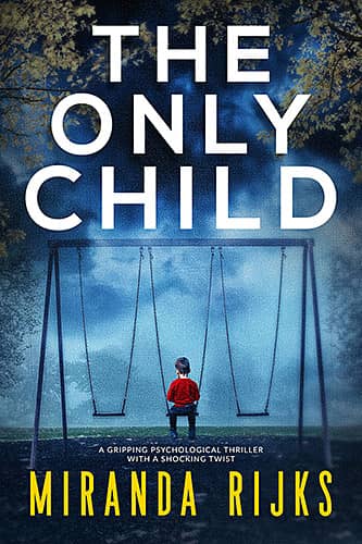
Designer: Kitten from Deranged Doctor Design
Book Title: The Only Child
Submitted by: Darja Deranged DoctorBook description: Chantal and Stuart are a golden couple. She’s a high-flying divorce lawyer dealing with the biggest case of her career, and he’s the darling of daytime television, on the cusp of A-list celebrity.
Alexander von Ness: Another great design from Kitten. I have nothing to comment on. Everything is done properly. Great work!
Gold-starred cover design. -

Designer: Gretchen Lovett
Book Title: Suicide Cop
Submitted by: Gretchen LovettBook description: I designed the cover myself with the help of Canva.
Alexander von Ness: There is too much emptiness at the top. The title should be moved up to fill the gap. It looks very unbalanced like this. I would suggest making the imagery slighty bigger, so that wording do not cover the hand and the elbow. The typography should be treated a bit differently. I would recommend a different font for the title.
-

Designer: Laura Boyle
Book Title: Fishing for More: A Memoir
Submitted by: Brett BloemendaalBook description: The book is a memoir about the author's story in finding himself through nature and fishing and eventually starting his own fishing business. His friend and videographer/photographer shot the cover image at sunrise right before making a fishing video, and when it came time to design a cover for the book, it seemed a perfect fit for the journey, and the designer knew exactly what to do with that image.
Alexander von Ness: The idea behind the cover is good but the photo still needs work. The typography is not made according to the rules of book cover design. This cover needs to be tweaked a bit more.
-
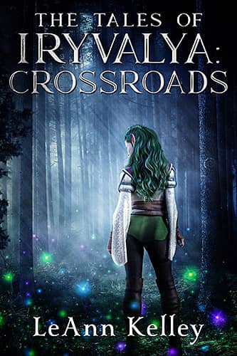
Designer: Deranged Doctor Book Covers
Book Title: The Tales of Iryvalya: Crossroads
Submitted by: LeAnn KelleyBook description: The main character (a mixed blooded elf) is looking off into the spirit forest surrounded by magical colorful bugs. The main character has elf ears, multiple shades of green hair, piercings in her ears, and braids in her hair. There is also a spiral in the tree off to the right. The blue tone is due to the color of the sky at night in her world due to the way the moons move in front of their suns.
Alexander von Ness: A cover made according to the wishes of the author. Very genre-appropriate. I would recommend leaving a little more space around the title.
-
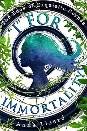
Designer: Emily's World of Design
Book Title: "I" For Immortality
Submitted by: Emily's WorldBook description: Book cover design for 'I' for Immortality, by Anna Tizard. Fantasy book cover design by Emily, Emily's World of Design
Alexander von Ness: Interesting cover design. Very well thought out. Unfortunately, the letters are not centered properly so this design gives the impression of inconsistency. A slight improvement in letters position would make a huge difference.
Gold-starred cover design. -

Designer: Emily from Emily's World of Design
Book Title: The Empty Danger
Submitted by: Emily WorldBook description: Book cover design for The Empty Danger by Anna Tizard, Fantasy cover design by Emily, Emily's World of Design
Alexander von Ness: All the same as the previous cover. Interesting cover design. Very well thought out. Unfortunately, the letters are not centered properly so this design gives the impression of inconsistency. A slight improvement in letters position would make a huge difference.
-

Designer: Emily from Emily's World of Design
Book Title: Believed
Submitted by: Michael EmbergerBook description: 1 out of 4 college girls experiences rape or sexual assault. That our society allows this to happen makes about as much sense as a mermaid in a Minnesota snowstorm. This is an advocacy novel to help raise awareness.
Alexander von Ness: This cover has a lot potential. I really like the simplicity of this cover design. There is still a lot of work to be done on the shadows because it looks quite unnatural. The typography needs a bit more work and that would be a huge difference.
Gold-starred cover design. -
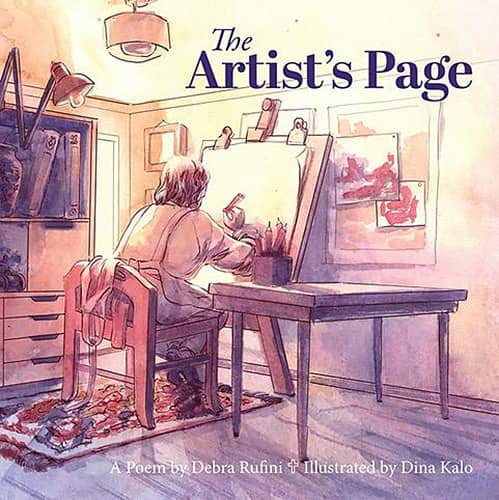
Designer: Dina Kalo
Book Title: The Artist's Page
Submitted by: Debra RufiniBook description: The Artist's Page cover is the creative work of Dina Kalo, which cleverly illustrates the mystery of the Divine Creator spoken of in this short story, brought to life throughout by similar illustrations. The story is ideal for those spiritually seeking, or spiritually sceptical.
Alexander von Ness: For a long time I haven't seen such a good illustration that almost perfectly describes the plot of the book. The title isn't balanced. A different approach to typography can turn this cover into a perfect cover design! Again, a beautiful illustration!
Gold-starred cover design. -

Designer: Zizi Iryaspraha Subiyarta
Book Title: Your Fabulous First Book: How to Write with Clarity, Confidence & Connection
Submitted by: Andrea GlassBook description: My brand colors are burgundy and gold. I like the idea of writing a book to be shown with a computer since that's how most authors write today.
Alexander von Ness: Nicely designed cover design. The colors were given so there is nothing to complain about. A bit of outer glow behind the lettering would make the title stand out more.
-

Designer: Tracey Dunham
Book Title: Christmas Child: Poems about Motherhood and Christmas
Submitted by: YEVGENIYA PRZHEBELSKAYABook description: Beautifully honest poems about motherhood and faith set during the first year of parenting and the season of Advent.
Alexander von Ness: The idea behind the cover is good, but the execution isn't too good. Too bad the designer didn’t apply some of her great design concepts I’ve seen in her portfolio. The typography should be redone in order to be more appealing and professional looking. I would recommend a different font for the subtitle. The cover lacks a professional touch.
-

Designer: Emily's World of Design
Book Title: Impermanent Universe: A Science Fiction Thriller – Book 1
Submitted by: Emily's WorldBook description: When astronaut Ryan Quinn dies during an ill-fated spaceflight, NASA computer scientist Tess Carrillo retreats into a blurry web of grief — until she's recruited by a famous visionary to lead a top-secret AI project.
Alexander von Ness: Pretty simple design. I think some element from the book should have been added.
-

Designer: Emily's World of Design
Book Title: Unvisited Tombs: A Science Fiction Thriller – Book 3
Submitted by: Emily's WorldBook description: As Tess's consciousness evolves to an unprecedented level, she starts to understand her ultimate destiny, realizing she's the only one who can stop the impending existential threats to Earth and all its inhabitants... But what about her past? What is real?
Alexander von Ness: All the same as for the previous design. Since this is a book from the series, I think that the title should have been positioned in the same place as the previous books.
-
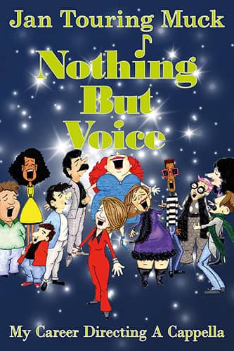
Designer: Dick Margulis
Book Title: Nothing But Voice: My Career Directing A Cappella
Submitted by: Dick Margulis MargulisBook description: The author's daughter-in-law, Maria Z. Touring, created the characters I used on the front cover.
Alexander von Ness: I'm not sure the typography is done at an acceptable level. The white outline is absolutely unnecessary. Moreover, it only reduces readability and visibility. Too many sparks in the background further impair readability. The typography needs a lot more work to make this cover look professional. The cover lacks a professional touch.
-
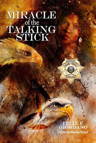
Designer: Pam Miller
Book Title: Miracle of the Talking Stick
Submitted by: Felix GiordanoBook description: Mallory Montana, where missing persons go to die Cold Case disappearances in western Montana gave renewed relevance to a local Native American legend of Saka'am Skaltamiax, a malevolent entity from the caverns of Great Northern Mountain.
Alexander von Ness: Very messy design. The readers gets distracted by all that. If there should be two eagles on the cover then the lower eagle should definitely be facing the opposite side to balance this design. The girl's head is too tilted so it looks like she's going to fall. The title and author's name aren't visible enough.
-
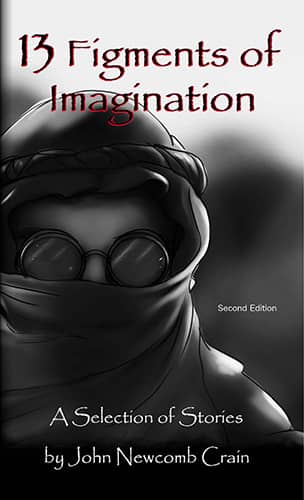
Designer: John Newcomb Crain
Book Title: 13 Figments of Imagination
Submitted by: John CrainBook description: 13 Figments of Imagination is an anthology of short science fiction stories by John Newcomb Crain. The cover illustration depicts the main character of one of the stories.
Alexander von Ness: I like the simplicity of this cover design. The illustration is great. If it was in color, it would be fantastic! I will not comment on the Papyrus font. Inadmissible! With colored illustration and the typography redone by professional this cover can be a masterpice!
-
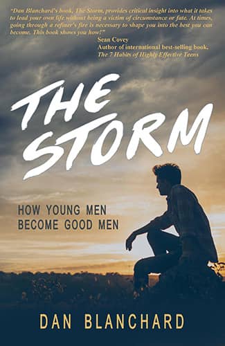
Designer: 1106 Design
Book Title: The Storm: How Young Men Become Good Men
Submitted by: Dan BlanchardBook description: As still just a teen, can Dakota master his Granddaddy's Secrets before life knocks him down for good? Living a life of hope against a backdrop of despair, violence, and poverty, Dakota's life is broken, and he's trying to fix it the best way he can.
Alexander von Ness: The picture lacks sharpness, contrast and color. It looks a bit washed out. The quote at the top takes up too much space and I think it should be at the bottom. I recommend to use the same font for the subtitle as the title. I would suggest a stronger font for the author's name.
-

Designer: Peter J. Marzano
Book Title: Litany Of Sorrows
Submitted by: Peter MarzanoBook description: Karl von Richter, a handsome young man with a dark past and a sinister future, is injured while skiing in the Italian Alps. He falls in love with Katrina Amorino, his dark-haired, blue-eyed nurse.
Alexander von Ness: The cover doesn't look like a fiction book and is transmitting a wrong message. The cold and impersonal design gives the impression that it is a non-fiction book. By adding different colors to the background of each of the four images, this cover could get a much more appealing look.
-

Designer: Danielle Lucas
Book Title: Somewhere Past Gum Creek
Submitted by: Russell RiendeauBook description: Somewhere Past Gum Creek is a book of poetry and prose. Given the themes of the book around adventure, reflection and introspection during a pandemic, the cover featuring Mt. Esja in Iceland (author summited and took photo) felt like the right vibe and message for the book.
Alexander von Ness: Great design. Great choice of colors and tones. Very professionally done. At first glance I thought the letters were cut off by mistake but after checking the designer’s portfolio I saw that the title was intentionally made that way. Really good.
Gold-starred cover design. -
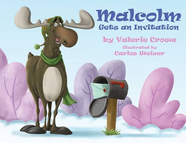
Designer: Carlos Weiser
Book Title: Malcolm Gets an Invitation!
Submitted by: Valerie CroweBook description: Cover illustration was done by Carlos Weiser, DocUmeant Designs completed it by adding all cover elements.
Alexander von Ness: Great illustrator, look at his portfolio. The typography should be treated a differently. I would recommend a different font.
-

Designer: Sonia Freitas
Book Title: The Zealots
Submitted by: Laura Bartnick BartnickBook description: When fast friends diverge from established paths, their lives are changed forever. Political angst of Roman rule has never been more harrowing than in first-century Judea.
Alexander von Ness: The character on the picture has been used so many times. Although this is a very attractive photograph, it has been used too many times and it should definitely be avoided.
-

Designer: Lynne Moulding
Book Title: What Is Coronavirus?: How It Infects, How It Spreads, and How to Stay Safe
Submitted by: Sabbithry PersadBook description: A fascinating comprehensive discussion of the novel coronavirus and the COVID-19 pandemic from the world of science and health research.
Alexander von Ness: I think there may be too many people in the illustration. Since this is a science-based book, I think it's good that it's devoid of unnecessary fictional looks.
-
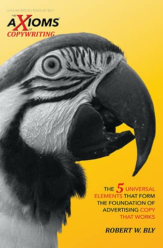
Designer: Anthony Raymond / Kallisti Publishing Inc.
Book Title: AXIOMS of Copywriting, The: The 5 Universal Elements That Form the Foundation of Advertising Copy That Works
Submitted by: Anthony MichalskiBook description: Each book in this new series of books, The AXIOMS, will have a beautifully rendered animal as the main focus of the cover. The idea is to let the "iconography" of the image sell the book rather than the title or subject.
Alexander von Ness: I think the “iconography” of the animal would be much more attractive and striking if it were in color. The parrot is special because of its colors so it’s not clear to me why those colors weren’t used to attract attention? The cover lacks a profesional touch, which is mostly visible in the typography.
-

Designer: Anthony Raymond / Kallisti Publishing
Book Title: AXIOMS of Marketing, The: The 6 Invariable Propositions That Underlie and Determine Every Marketing Success
Submitted by: Anthony MichalskiBook description: Each book in this new series of books, The AXIOMS, will have a beautifully rendered animal as the main focus of the cover. The idea is to let the "iconography" of the image sell the book rather than the title or subject.
Alexander von Ness: I think the “iconography” of the animal would be much more attractive and striking if it were in color. The giraffe is special because of its colors so it’s not clear to me why those colors weren’t used to attract attention? The cover lacks a profesional touch, which is mostly visible in the typography.
-
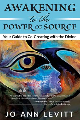
Designer: Jessica Murrell
Book Title: Awakening to the Power of Source
Submitted by: Jessica MurrellBook description: Awakening to the Power of Source is the springboard for engaging more consciously and deliberately in the channeled practice of Co-Creating with Spirit.
Alexander von Ness: One of the most basic rules of book cover design is to use as few different fonts as possible. Here we have seemingly three different fonts but with the combinations bold and italic we have six different types of letters. The typography needs a lot more work. The transition from the illustration to the title is too rough.
-

Designer: Carl Leaver
Book Title: Harnessing the Power of Grief
Submitted by: Betty LeaverBook description: The message of the book is that new, vibrant life can grow from the darkness and sorrow of death.
Alexander von Ness: I really like the simplicity of this cover design. I think it is necessary to sharpen the image. The flower should drop by half its size and thus free up space for the title. The glow around the flower would strengthen the design and attract more attention. The typography needs a bit more work.
-

Designer: Jera Publishing
Book Title: A Son's Promise: A Memoir of Perseverance from Liberia to America
Submitted by: J. Marsilius FlumoBook description: Mom lost ten out of thirteen children. In elementary school, she asked me to write her story. She wanted a better life for me and supported my education. At an early age, I absorbed her pain and wanted to grow up and have children to compensate her losses. She died seven years before I finished the book.
Alexander von Ness: Too bad Mom didn't get the book. The main picture definitely needs better treatment. I have no further comments on this design other than the desire to make the book sell as well as possible. The cover captures the essence of the book.
We hope you learn something new about what works and what doesn’t work in this book cover design awards contest, and that it will help you correct any omissions and improve your book cover. Remember, a good book cover design is the best marketing tool you have to sell your book, and don’t get it wrong right from the start.
Award winners and Gold-Starred covers win the right to display our badges on their websites.
The deadline for the next submissions will be 25th February 2022.
Click here to submit your e-book cover.
Join the Self-Publishing and Book Marketing Group.
The original announcement post.
Book Cover Design Awards, November 2021
Book Cover Design Awards, October 2021
Book Cover Design Awards, September 2021
Book Cover Design Awards, Cover Design, Self-Publishing,