
Alexander von Ness - February 21, 2024
Book Cover Design Awards – February 2024
Welcome to the Book Cover Design Awards by Self-Publishing and Book Marketing Blog.
Judge: Alexander von Ness
Alexander is a book cover designer with almost thirty years of professional experience in graphic design, including over a decade as an art director in a branding agency. His website and blog are among the top trusted sites for book cover design services overall and have been selected as one of the 100 Best Websites for Writers.

The winner of this month’s
Book Cover Design Awards is
Ivan Zanchetta
Designer: Ivan Zanchetta
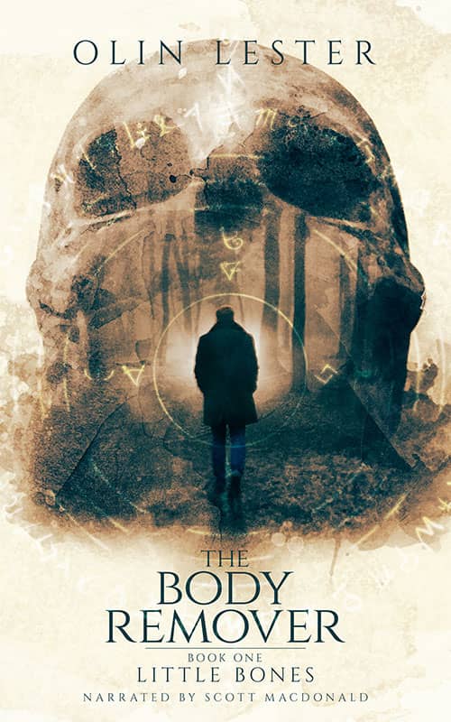
Book Title: The Body Remover: Little Bones
Submitted by: Ivan Zanchetta
Book description: The client asked for a cover with a touch of surrealism because his book is a crossover between a a psychologicale and a supernatural thriller.
Alexander von Ness: Beautiful design that truly stands out! Perhaps a subtle white shadow under the letters could enhance legibility slightly, but overall, it's excellent. This cover would definitely catch a reader's eye in a bookstore, fulfilling the essential goal of cover design. Heartfelt congratulations on this impressive work!
-
Designer: Linggar Bramanty
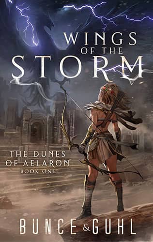
Book Title: Wings of the Storm
Submitted by: Christopher GuhlBook description: The cover features the main character, Vayo, looking toward the ancient Temple of the Storm Gods. She led her people there after freeing them from slavery.
Alexander von Ness: The illustration is star-worthy indeed! However, tightening the title's letter spacing ('kerning') could significantly enhance readability and the cover's overall look. Consider experimenting with typography to elevate your impressive design.
Gold-starred cover design. -

Designer: Daris Howard
Book Title: The Last Man off the Mountain
Submitted by: Daris HowardBook description: In this book, Tom Johnson has been asked to be scoutmaster for a troop with 18 tough boys.
Alexander von Ness: A redesign could greatly improve this cover. Simplifying the fonts to one or two would create more harmony. A white title would stand out better, and applying a Photoshop filter could enhance overall cohesion.
-

Designer: Barrie Fisher
Book Title: In Every Belief is a Lie
Submitted by: Lisa SchermerhornBook description: I gave Barrie Fisher the concept and she created the image of me on the cover.
Alexander von Ness: The separation of 'lie' from 'belief' adds depth to your design, a clever touch indeed. However, the pale colors create a washed-out effect. Consider adding bold elements or intensifying the background image for more impact. Additionally, highlighting the left hand further could enhance visual appeal, making the cover more dynamic and engaging.
-
Designer: Rachael Clarke
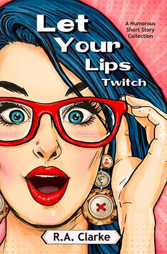
Book Title: Let Your Lips Twitch
Submitted by: Rachael ClarkeBook description: I designed this cover to embody a comedic spirit, and also include details/hints from several different stories contained within the book (a humorous short story collection).
Alexander von Ness: The illustration shows promise, but the title execution needs refinement. However, the concept of incorporating details into the earrings is a brilliant touch and adds a unique element to the design.
-

Designer: Ivan Zanchetta
Book Title: Lost Bastard
Submitted by: Ivan ZanchettaBook description: This is the first book in a romantic thriller series by a USA Today bestselling author. The idea was conveying the idea of danger, action and romance in a single image.
Alexander von Ness: Outstanding design! Every element seems intentionally crafted, and the designer's vision is clearly and effectively realized. No critiques to offer.
Gold-starred cover design. -
Designer: Ivan Zanchetta
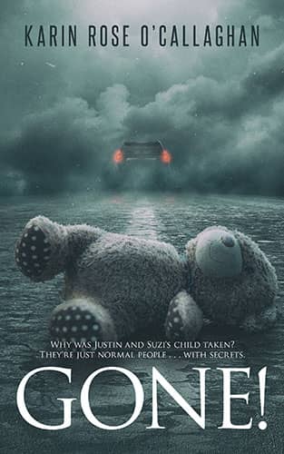
Book Title: Gone!
Submitted by: Ivan ZanchettaBook description: The book is about a kidnapped child. The abandoned teddy bear conveys the idea pretty well and it's perfectly visible even in thumbnail size, which is a key feature in today's market.
Alexander von Ness: The design is solid, but the concept feels somewhat overused. Tweaks like making the author's name white, amplifying the car's light, and changing the bear to brown could significantly boost the cover's appeal.
-

Designer: Tamara Dever
Book Title: Ultimate Mix Tape
Submitted by: Tamara DeverBook description: This quiz book covers a wide array of popular music from the ’70s and ’80s—the cassette era. The targeted GenX crowd would instantly know what a mix tape is and be drawn to its image and the bright colors.
Alexander von Ness: Love the concept and visual appeal, but there might be too much text, which could be distracting. Consider reducing it to enhance the cover's overall attractiveness.
-
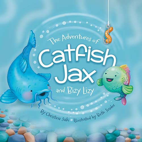
Designer: Tamara Dever
Book Title: The Adventures of Catfish Jax & Bizy Lizy
Submitted by: Tamara DeverBook description: An adorable underwater tale of two friends searching for snacks and meeting new friends.
Alexander von Ness: Lovely illustration! Incorporating 'sea' elements into the title execution could further captivate and engage our young readers.
-

Designer: Tamara Dever
Book Title: Bottled Lightning
Submitted by: Tamara DeverBook description: A tale of intrigue that takes place in Tokyo, involves new technology, and murder.
Alexander von Ness: Decent design, but the katana needs to be more prominent. A 'Japanese' font style could enhance the theme and appeal to those interested in Japanese culture.
-
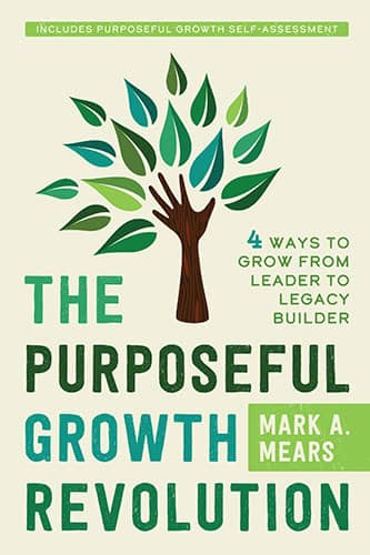
Designer: Shiloh Schroeder
Book Title: The Purposeful Growth Revolution
Submitted by: Mark MearsBook description: My book cover captures the essence given the color palette used, its earthy/natural look, tone and feel featuring a marriage of the type style and key image.
Alexander von Ness: While botanical designs are popular, this one feels too generic with its overused leaf petals. It risks blending in with other books on personal growth. A fresh approach could make it more distinctive.
-
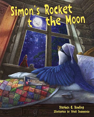
Designer: Stephen Bowling
Book Title: Simon's Rocket to the Moon
Submitted by: Stephen BowlingBook description: This is a children's picture book about a young bird who wonders about the Moon.
Alexander von Ness: Superb illustration! However, the font choice and execution for the title seem mismatched and inexperienced, particularly the use of the moon for the letter 'O.' With the right title design by an experienced designer, this could significantly boost book sales.
-
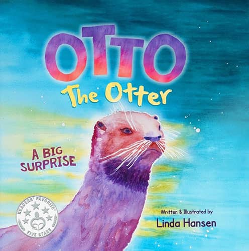
Designer: Linda Hansen
Book Title: Otto the Otter, A Big Surprise
Submitted by: Linda HansenBook description: I am a first-time author/illustrator of a children's picture book. The book is my work from cover to cover. I paint in watercolor.
Alexander von Ness: Nice illustration, but the title's execution is lacking with four different fonts used, a common pitfall. With a skilled designer reworking the title, this cover has the potential to significantly increase book sales
-

Designer: Peter Marzano
Book Title: Search and Deception
Submitted by: Peter MarzanoBook description: The photos on the cover are places I've visited and have incorporated into the suspenseful story.
Alexander von Ness: I've previously commented on this design in past competitions, and my opinion remains unchanged.
-
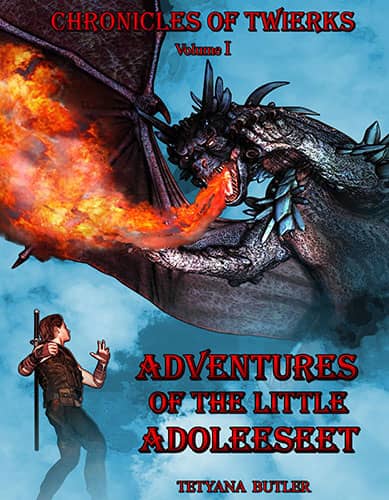
Designer: Tetyana Butler
Book Title: Adventures of the Little Adoleeseet
Submitted by: Tetyana ButlerBook description: What is Twierks? No one knows! One of the inhabitants of the mysterious Daeya, mentions that Twierks is the password to enter the world of the magic and sorcerers.
Alexander von Ness: Once again, the book title and font choice need improvement. Adding a call to action could transform this design from average to exceptional!
-

Designer: Mark Schmitz
Book Title: Nunzio's Way
Submitted by: Kira HenschelBook description: Against the backdrop of Mafia turf wars, local gang battles, and political power-plays in the mayoral election, the bodies begin stacking up.
Alexander von Ness: Excellent design! Consider emphasizing the wolf's eyes with vibrant colors for added impact, but overall, it's great as is."
Gold-starred cover design. -

Designer: Martina Angela Müller & Ann Erwin
Book Title: And Who Shall Teach the Teachers?
Submitted by: Patrice MaynardBook description: Martina Angela Müller is a painter and an art educator in many media: painting; sculpture; mobiles; eco-sculptures in nature; etc.
Alexander von Ness: A completely new design is necessary here.
-

Designer: Ann Erwin
Book Title: From Mechanism to Organism
Submitted by: Patrice MaynardBook description: The book is written to coach teachers and parents on ways to understand human development from a living perspective, not one designed on mechanical principles.
Alexander von Ness: While I don't want to be stereotypical, the design feels somewhat superficial and doesn't effectively match the book's subject. A different approach may better convey the content.
-

Designer: Tamara Dever
Book Title: Fore! Gone.
Submitted by: Tamara DeverBook description: Lovely, historical gift book that focuses on the unique topic of golf courses that used to exist in Minnesota.
Alexander von Ness: There's potential for a much better design here. It's a missed opportunity not to utilize the image more effectively, especially with the highlighter as the stick holder. Additionally, the title should better reflect the book's theme.
-
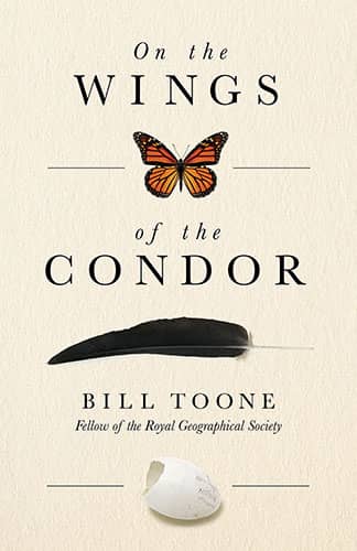
Designer: Marisa Jackson
Book Title: On the Wings of the Condor
Submitted by: Tamara DeverBook description: The memoir of a widely-recognized conservation biologist in search of the true meaning of “conservation.” His story ranges from bugs in his parents’ garden, raising baby gorillas, to the California Condor Recovery Program and on to the rain forests of some of the world’s remotest locations.
Alexander von Ness: I love the simplicity of this design. Using dark gray letters instead of pure black could create an even softer look. Excellent design!
Gold-starred cover design. -

Designer: Anthony Raymond
Book Title: The Covenant Secret
Submitted by: Anthony MichalskiBook description: A very simple design for a book that is a modern-day parable.
Alexander von Ness: Great concept! Consider removing the unnecessary shadow under the blue letters to prevent text blur. Also, adding detail to the pupil of the large eye could enhance impact.
-

Designer: Anthony Raymond
Book Title: Walk, Don't Run
Submitted by: Anthony MichalskiBook description: A cover that reflects the time and place and FEEL of the book. Rock on!
Alexander von Ness: The concept of using traffic light colors is fantastic, but the execution appears amateurish. Adding vibrant colors and a 'rocker' font could greatly enhance this design.
-
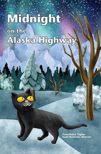
Designer: Daniel Marhuenda
Book Title: Midnight on the Alaska Highway
Submitted by: Constance TaylorBook description: Daniel Marhuenda is a graphic designer and illustrator from Barcelona, Spain. He specializes in illustration for children, and he gets his inspiration from nature and literature.
Alexander von Ness: Once again, the title and font don't match the child-friendly illustration. It reads more like a technical manual. Kudos to the illustrator for the excellent artwork.
-
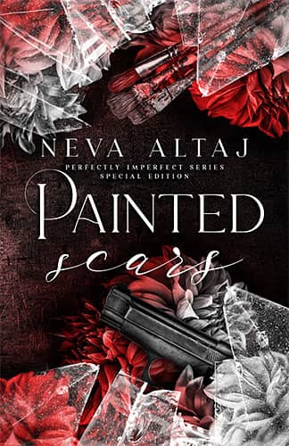
Designer: Marushka
Book Title: Painted Scars
Submitted by: Darja Deranged DoctorBook description: Charming, captivating, and seductive, And a cold-blooded killer. But I married the Pakhan of the Russian Bratva anyway. I had to. It was part of the deal. Now, I'm faking marital bliss, As I tremble with fear, And I cannot wait to be out of the clutches of this ruthless man.
Alexander von Ness: The letters, especially the subtitle, are a bit lost and poorly readable. Additionally, the word 'scars' is quite illegible due to the font choice and position.
-
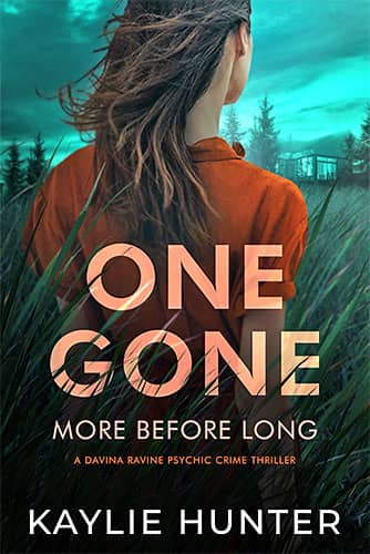
Designer: Kitten
Book Title: One Gone More Before Long
Submitted by: Darja Deranged DoctorBook description: Davina Ravine isn't looking for trouble. Not from the hot new detective who keeps falsely arresting her. Not from gossipy locals who whisper about her. And certainly not from her father, who repeatedly tries to kill her.
Alexander von Ness: Excellent cover! Wouldn't change a thing!
Gold-starred cover design. -
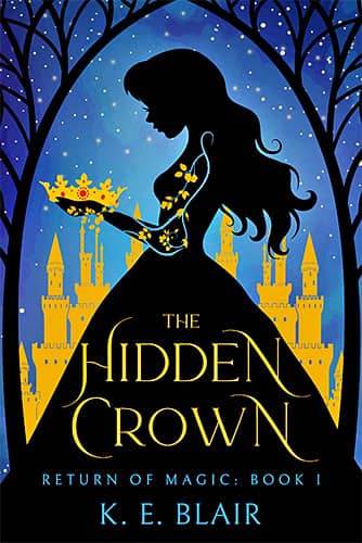
Designer: Nancy
Book Title: The Hidden Crown
Submitted by: Darja Deranged DoctorBook description: Trapped in her life as a servant in a magicless kingdom, Anslee yearns for the freedom she felt roaming the woods as a child. Convinced marrying a nobleman is her only way out, she should be ecstatic when she catches the eye of new-in-town Lord Avery Varrock. But this lord has brought more than riches to town – and his revelations will turn Anslee's life upside down.
Alexander von Ness: Excellent cover! Wouldn't change a thing!
Gold-starred cover design. -

Designer: Kitten
Book Title: The Jealous Wife
Submitted by: Darja Deranged DoctorBook description: About to become parents, my husband and I decide to move to my small hometown to be closer to my family. Everything was perfect until I met our new neighbor- the reason I moved away to begin with.
Alexander von Ness: Excellent cover! Wouldn't change a thing!
Gold-starred cover design. -
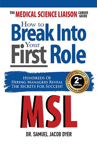
Designer: Athur Sinai
Book Title: The Medical Science Liaison Career Guide: How to Break Into Your First Role
Submitted by: Samuel DyerBook description: The cover design is meant to be direct and informational. The cover prominently displays the book's title in large, bold typeface, with the key subtitle "Break Into Your First Role" highlighted in contrasting red to attract immediate attention.
Alexander von Ness: Excellent cover! It succinctly and clearly conveys the book's content right from the start. Well done!
-

Designer: Mallory Rock
Book Title: Losing My Breath
Submitted by: Jennifer BlackBook description: The MMC is a veteran Marine. He and his new neighbor develop a friendship working out together. The FMC has lived a somewhat sheltered life. She's strong-willed and determined but a bit naive for downtown urban living. Hence the MMC referring to her as a "princess"
Alexander von Ness: At first glance, I mistook the cover's design for clipart, but upon further investigation, it appears to be an illustration. Regardless, I advise against using clipart for cover designs, as it can cheapen the overall look. The cover resembles the first page of a PowerPoint presentation rather than that of a serious book. Despite this, the book has great reviews on Amazon.
-

Designer: Greg Gersch
Book Title: I Chose Love: How to Thrive After a Life-theatening Illness Using Love to Guide You
Submitted by: Sandi GoldBook description: I – the author – painted the painting on the cover.
Alexander von Ness: I'm skeptical that this is a painting; it seems more like a photo with Photoshop filters. Using four different fonts on the cover is a common mistake in book cover design.
-

Designer: Onur Burc
Book Title: Delaware from Railways to Freeways
Submitted by: Dave TablerBook description: The challenge with this cover was to convey visually the idea of the primacy of the railway giving way to the primacy of the freeway. Notice the pen & ink train image fades at the point the locomotive crosses the portal. Furthermore, at that same point the yellow 'spark' changes the train track into a roadway.
Alexander von Ness: The map should be behind the locomotive, and the road should match the locomotive's style. The author's name crossing the road and map reduces readability and visibility unnecessarily.
-

Designer: Dreemer Designs
Book Title: Wayward Patriot: Preserving the Vote
Submitted by: Jack MeyerBook description: The picture on the front of the book was a painting by Lori Ehlke.
Alexander von Ness: The title, subtitle, and author's name feel cramped in a small space, while unnecessary empty space detracts from the picture. With experienced adjustments, this design could be excellent.
-

Designer: Ken Schellenberg
Book Title: Songs for the Spirit / Canciones para el Espiritu
Submitted by: Robert L. GironBook description: "Songs for the Spirit / Canciones para el Espiritu" is an ecumenical re-write of the Psalms of the Bible. The artwork used for the book cover by artist by B. Ridgeway fits perfectly with the message of the book: Love is the spiritual message. Its vibrant colors of red and purple blend into an abstraction of the Spirit which has no shape or visage. It's the energy of the Spirit that survives and encompasses all the universes and its galaxies, and all those within.
Alexander von Ness: The explanation provided by the author doesn't necessarily reflect the design's potential. There's room for improvement.
-

Designer: Ken Schellenberg
Book Title: The Shape of Things to Come: Poems
Submitted by: John BlairBook description: "The Shape of Things to Come: Poems" is a poetic interpretation of the Manhattan Project that penetrates the times and the consequences of the atomic age, with all the ramifications. The book cover image of the atomic bomb explosion cuts to the quick. The message is quite clear: We need to be cautious because the consequences of an atomic war might just end the Earth's existence as we know it and all who live on it.
Alexander von Ness: Great concept, but typography could use a bit more attention for better attention-grabbing qualities
-
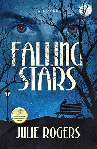
Designer: Emir Orucevic
Book Title: Falling Stars
Submitted by: Julie RogersBook description: A novel about historic Eureka Springs' resident vampire.
Alexander von Ness: Excellent design! I'd suggest making the author's name even bigger with increased letter spacing for added prominence
Gold-starred cover design. -

Designer: Julia Kuris
Book Title: Red Hot Living
Submitted by: Karina CookeBook description: From the designer: "You will see I used a bright and colorful, textured motif. I played around with the subtitle to bring it out a bit more from the background. White color works best because we have such a colorful background, so I thickened the line slightly and added a drop shadow to lift it off the page."
Alexander von Ness: Impressive design! To enhance readability, consider making the subtitle more noticeable with bold letters, especially given the contrast with the background. Overall, excellent work.
-

Designer: Julia Kuris
Book Title: Daddy's House
Submitted by: Karina CookeBook description: I envision art featuring myself as a child with my house, cotton, and roots in the background.
Alexander von Ness: This design exudes calmness and effectively communicates the book's content. Well done.
We hope you learn something new about what works and what doesn’t work in this book cover design awards contest and that it will help you correct any omissions and improve your book cover. Remember, a good book cover design is the best marketing tool you have to sell your book, and don’t get it wrong right from the start.
Award winners and Gold-Starred covers win the right to display our badges on their websites.
The deadline for the next submissions is September 30, 2024.
Click here to submit your e-book cover.
The original announcement post.
Book Cover Design Awards, August 2022
Book Cover Design Awards, January 2022
Book Cover Design Awards, November 2021
Book Cover Design Awards, October 2021
Book Cover Design Awards, September 2021
Book Cover Design Awards, Cover Design, Self-Publishing,