Alexander von Ness - September 2, 2021
Book Cover Design Awards – September 2021
Welcome to the Book Cover Design Awards organized by The Self-Publishing and Book Marketing Blog.
Last month we received 21 covers.
Judge: Alexander von Ness
Alexander is a book cover designer with almost thirty years of professional experience in graphic design, including over a decade as an art director in a branding agency. His website is among the top trusted sites for book cover design services overall and this Self-Publishing and Book Marketing Blog has been selected as one of the 100 Best Websites for Writers.

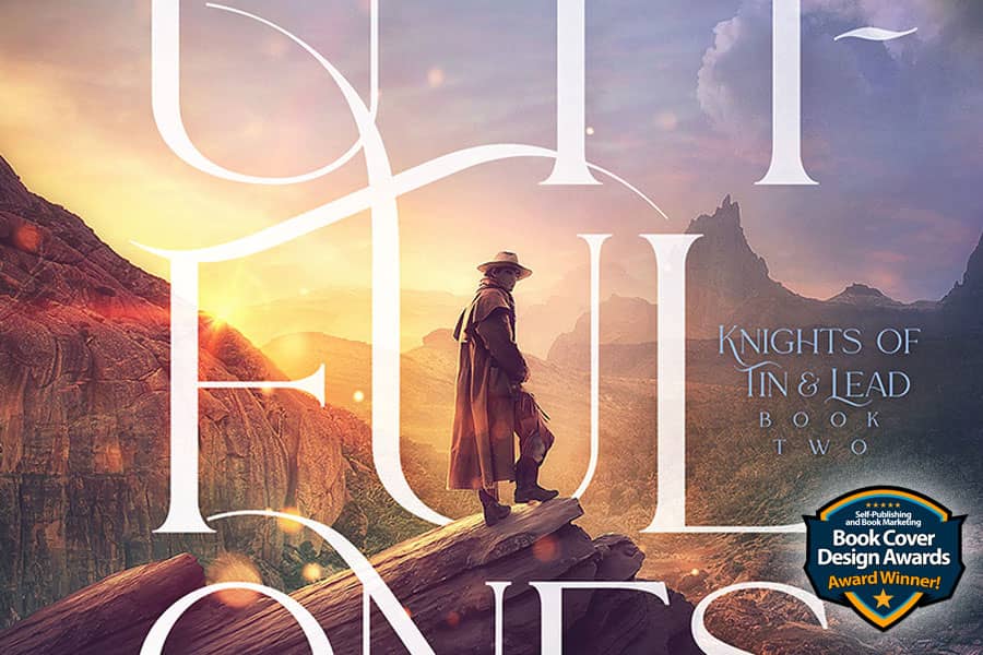
The winner of this month’s
Book Cover Design Awards is
James T. Egan of Bookfly Design
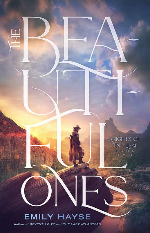
Designer: James T. Egan of Bookfly Design
Book Title: The Beautiful Ones
Submitted by: James Egan
Book description: This is the second in the Knights of Tin and Lead series, which blends western and Arthurian fantasy elements.
Alexander von Ness: Beautiful design! This cover design won me over with its decency and harmony. The typography is so superbly made that it is immediately obvious that this cover design was made by a professional who knows very well what he is doing. I have nothing to say except that I am thrilled with this cover design! Definitely, one of the most beautiful cover designs I’ve seen lately.
-
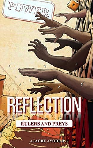
Designer: Lincoln's Art
Book Title: Reflection
Submitted by: Ayodeji AjagbeBook description: Reflection: Rulers And Preys stars a student politician Comrade Oluwatimileyin Turner, Chief Whip, a cynical, manipulative politician determined to become President. He is willing to use every secret he knows, every pressure point he can find, and every dirty trick in the book to secure his own rise to power.
Alexander von Ness: Great illustration but the typography is not up to standard. You should highlight the title and change the font. The author's name should be increased. Find a designer who will improve your typography and you will have a perfect cover design!
-

Designer: Shreyas Mogal
Book Title: Macando
Submitted by: Shreyas MogalBook description: A crime fiction which revolves around murders, financial crimes, politics and the spirit of the city of Mumbai. The novel focuses on the life of a musician.
Alexander von Ness: This cover design has potential but needs a little improvement. I would put a glow around the guitarist to emphasize contrast. Be sure to delete the frame around the title. My suggestion is to put the author’s name on the bottom of the cover and change it to white. The subtitle should definitely be placed at the top above the title and a little effort should be made to make a new and better title. Fix the typography and you will be surprised how good this design can be.
-
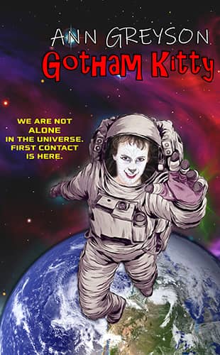
Designer: Ann Greyson
Book Title: Gotham Kitty
Submitted by: Ann GreysonBook description: The cover represents the story of an alien's arrival to Earth.
Alexander von Ness: A cover design that could have been great had it not been destroyed with poor typography and the wrong choice of fonts. This cover design could look great if an experienced cover designer fixed it. This way it looks very amateurish and cheap. I'm sorry to have to say that, but it's in the best of intentions. Find a designer who will fix the typography and you will have a great cover for your book.
-

Designer: Jim Weems
Book Title: Go for No! for Network Marketing
Submitted by: Andrea WaltzBook description: This book takes a journey through go for no philosophies and strategies and expands them into greater detail while applying Ray Higdon's expertise on each subject.
Alexander von Ness: Excellent cover design that has become the author's brand over the years. A very consistent cover design that has elements of fiction but immediately lets us know that it is a non-fiction book. I wouldn’t change anything but if I had to fix something, I would enlarge the image of the person looking at the title of the book.
Gold-starred cover design. -

Designer: George Stevens
Book Title: Guide & Grow: Baby's 1st Year
Submitted by: Sharon DrewloBook description: The book is a monthly guide to development, milestones, and activities to support baby's development from birth to their 1st birthday. I wanted my brand colors since it directly relates to my work in my practice.
Alexander von Ness: This design immediately lets us know who this book is intended for, thus fully fulfilling its purpose. If I had to improve something, I would reduce the red part at the bottom and increase the subtitle and the picture of the children. I looked at the designer’s portfolio. Great designer.
-

Designer: Andrea Schmidt
Book Title: TRICARE Around the World
Submitted by: John LetawBook description: The goal of my cover is to 1) Appeal to a military audience; this impacted our color scheme; 2) Inspire excitement about world travel, via the graphic; 3) Instantly convey the scope of my book via the subtitle.
Alexander von Ness: Interesting cover design. The only thing I would change a little is the color of the sky. I would brighten the sky and make it more attractive and cheerful. This way it looks quite sad and tired. This book gives hope to its readers and the cover should make it known. Anyway, nice cover design.
-
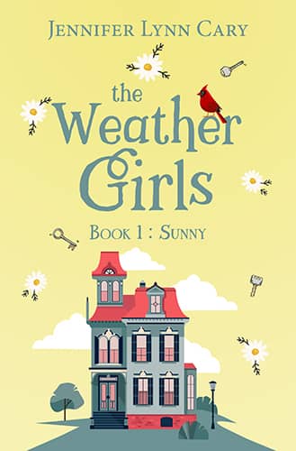
Designer: London Montgomery Covers
Book Title: Sunny
Submitted by: Jennifer Lynn CaryBook description: A Christian historical romance with a rom-com feel and set in Kokomo, Indiana in 1970 and is inspired by Bobby Hebb's song "Sunny." Accountant for the Governor, Sunny Day, dumps her boyfriend and loses her job, all before lunch on Monday, so she decides to go home and start over without a clue how to do that.
Alexander von Ness: Cheerful cover design. Cute font selection for the title. I don’t know what the meaning of flowers is but I think they should be a little bigger. My suggestion is to put the subtitle “Book 1: Sunny” on the bottom of the cover in white.
-

Designer: London Montgomery Covers
Book Title: The Traveling Prayer Shawl
Submitted by: Jennifer Lynn CaryBook description: A Christian split-time novel. Cami Madison's grandmother's will cannot be probated until Cami accepts a challenge and completes in two months time, which incidentally lines up with the biggest project Cami's ad agency has ever undertaken.
Alexander von Ness: I do not conclude anything from the description of the book, so I cannot comment on anything. I don't know what knitting and this book have to do with it. In any case, further work on the cover is required.
-
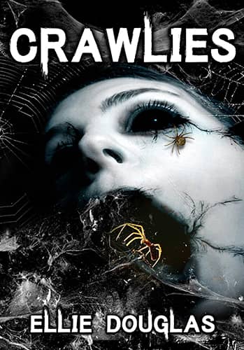
Designer: Ellie Douglas
Book Title: Crawlies
Submitted by: Ellie DouglasBook description: A tale of eight legged terror as the arachnid menace unleashes a web of vengeance against human kind. Told from the spider's point of view.
Alexander von Ness: This is obviously a horror book and the cover design as such is hit. However, this cover design looks unimpressive due to passivity. Since the spider is the main character here, it should definitely be strongly emphasized. Very great potential for progress. Don't be afraid to experiment and you will be surprised how great this cover design could be.
-
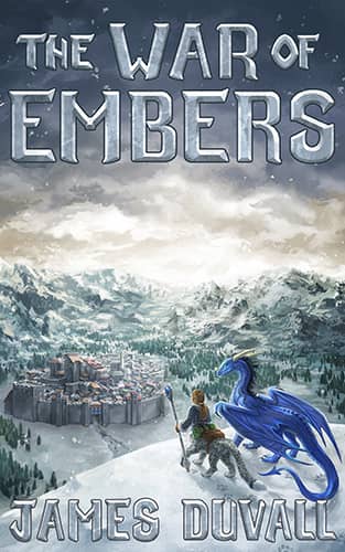
Designer: Laura Ernzen
Book Title: The War of Embers
Submitted by: James DuvallBook description: Cover features a painted scene directly from the book featuring the protagonists: Syrrus Danso (the half snow leopard mage) and Joshua Woods (the dragon). City featured is Sundor Tower!
Alexander von Ness: Very good cover design. Everything is clear at first glance. I might just add a subtitle to put above the title, so it intrigues readers a little more. I would change the author's name to one of the dark blue colors because it is barely visible on the thumbnail. All in all, very good cover design.
Gold-starred cover design. -
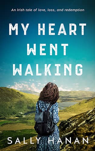
Designer: Vanessa Mendozzi
Book Title: My Heart Went Walking
Submitted by: Vanessa MendozziBook description: My Heart Went Walking is a heartbreakingly beautiful novel that sweeps from the small Irish town of Donegal to the “big smoke” of Dublin City; a book that celebrates the pull of family and the chance of redemption.
Alexander von Ness: Great cover. Simplicity is the greatest strength of this design. I have no objections nor would change anything. I looked at the designer portfolio and saw some beautiful designs.
Gold-starred cover design. -

Designer: Vanessa Mendozzi
Book Title: You're Completely Normal
Submitted by: Vanessa MendozziBook description: Former Miss New York and current mom of two littles living in Alaska, Shannon Leyko knows what it’s like for life to go a bit sideways. By the time she was a 24-year-old college graduate working as a dancing banana in Times Square, she realized she should probably brace for more career curveballs than once envisioned.
Alexander von Ness: Simple and attractive design that immediately catches the eye. I think the subtitle is illegible and maybe it should be fixed. All in all, an attractive and appealing cover.
-
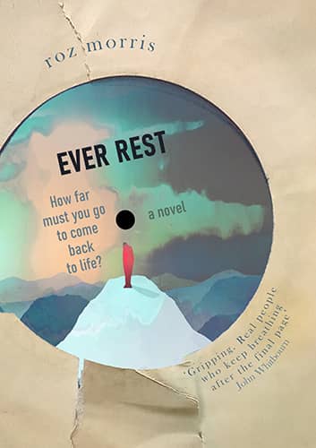
Designer: Roz Morris
Book Title: Ever Rest
Submitted by: Roz MorrisBook description: I wanted to express the title and the novel's elegaic and nostalgic tone. I added the record sleeve, redrew the picture with Owen Gent permission and used Oswald font for the titling.
Alexander von Ness: Beautiful cover. As soon as I saw it, I really liked it. The record sleeve is a great idea. If I had to change something, I would enlarge the title and change it to white. If this competition had two winners, this design would surely be the second winner.
Gold-starred cover design. -

Designer: Phi_md
Book Title: Kuroi Chi: Birth of A Kunoichi
Submitted by: Olivia ThompsonBook description: My novel is designed for anime fans. The story is about a young girl who was bought out of slavery, by a power-hungry regional lord, and raised to become an assassin.
Alexander von Ness: Very inconspicuous cover. The illustration is acceptable but the typography is disastrous. This cover design seemed to be done by two people. One made an illustration while the other destroyed everything with typography. I don’t want to be rude but this cover design does more harm than good for this book.
-

Designer: Cukipingvin
Book Title: Child of Water: The Prequel
Submitted by: Olivia ThompsonBook description: This novel is for anime fans. The story is a sad one about a foreign woman, with a mystical power that allows her to manipulate water, who's held captive in a region of Southern Japan. There's a drought in Southern Japan and a powerful warlord tells her that she's only free to roam his land and that she must be kept hidden.
Alexander von Ness: Lovely illustration but cover in the end looks amateurish due to poor typography. As I suggested to another author in this competition, find a designer who will improve your typography and you will have an outstanding cover design!
-
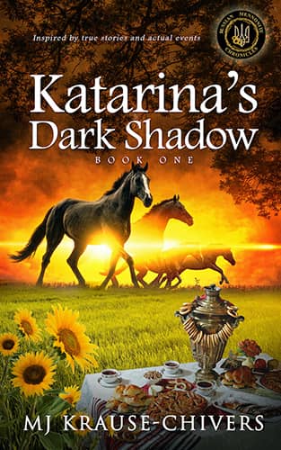
Designer: 100 covers
Book Title: Katarina's Dark Shadow
Submitted by: Miranda J. ChiversBook description: The story is inspired by the actual cultural genocide of the Russian Mennonites in southern Ukraine during and after the Russian Revolution. The book cover shows the Four Horses of the Apocalypse as reflecting war, the sunflowers to signify Ukraine, and the classic Russian tea table which identifies the culture.
Alexander von Ness: I am confused by the description of the book and the look of the cover. I find it a little strange that the Four Horses of the Apocalypse look so tame and attractive. While this is a very nice cover, nowhere do I feel the “smell” of war and revolution. The cover looks “too romantic” for the theme it deals with.
-

Designer: Milo from Deranged Doctor Design
Book Title: Punching Tickets
Submitted by: Deranged Doctor DesignBook description: Book cover design for Punching Tickets, by Franklin Horton. Post-Apocalyptic cover design by Milo, Deranged Doctor Design.
Alexander von Ness: Great cover! Challenging and intriguing. It looks great on thumbnail size and on paperback. The brightness and tonality of the colors are completely affected and adapted to the series. Since this is a book that is part of a series, the designer did a great job and continued the series of covers in a striking style. One of the candidates for the winner of this competition.
Gold-starred cover design. -
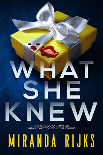
Designer: Kitten from Deranged Doctor Design
Book Title: What She Knew
Submitted by: Deranged Doctor DesignBook description: Book cover design for What She Knew, by Miranda Rijks. Thriller cover design by Kitten, Deranged Doctor Design.
Alexander von Ness: Great cover design but I have one big complaint. Font selection. As soon as I saw this cover, I saw a non-fiction book and I can’t “switch” that this is a fiction book. The more I look at this cover, the more I think this is a non-fiction book. It may be the same font but if the title was much smaller it would seem more acceptable. I give it a star because the design is nice.
Gold-starred cover design. -
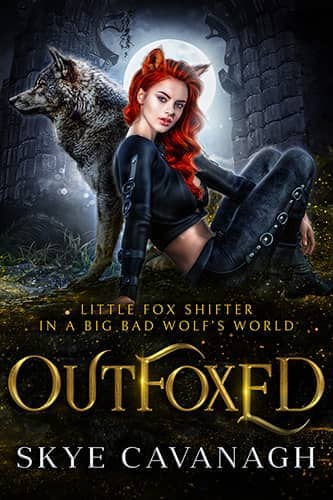
Designer: Dragana from Deranged Doctor Design
Book Title: Outfoxed
Submitted by: Deranged Doctor DesignBook description: Book cover design for Outfoxed, by Skye Cavanagh. Paranormal & Urban Fantasy cover design by Dragana, Deranged Doctor Design.
Alexander von Ness: Decent cover design. I understand that this design should be dark, but in my opinion everything is too dark and the characters should be much more pronounced and brighter. The wolf should definitely be a lot brighter. I would lower the wolf and the girl a little lower to emphasize the moon. The whole cover looks very blurry to me, it should be sharpened. Nice design.
-

Designer: James T. Egan
Book Title: The Entity Game
Submitted by: James EganBook description: This cover is for a political/espionage thriller and the first entry in the Aurora Donati series.
Alexander von Ness: Interesting cover! The whole composition is so good that the Capitol is noticed when you look a little better. A very confident cover that has fully fulfilled its purpose and everything that is expected of it. I have nothing to add here but I can only congratulate the top designer. While I know there are no coincidences with designers in this category, I might just change the warm orange-red to pure red. Without a doubt, great design!
Gold-starred cover design.
We hope you learn something new about what works and what doesn’t work in this book cover design awards contest, and that it will help you correct any omissions and improve your book cover. Remember, a good book cover design is the best marketing tool you have to sell your book, and don’t get it wrong right from the start.
The deadline for the next submissions will be 30th September 2021.
Click here to submit your e-book cover.
Join our Self-Publishing and Book Marketing Group.
The original announcement post.
Award winners and Gold-Starred covers win the right to display our badges on their websites.
If any of you are interested in redesigning your cover, visit the Book Cover Redesign page to see examples of the successful redesign. All of you who have entered this contest have an additional $50 discount on the redesign of your cover.
Book Cover Design Awards, Cover Design, Self-Publishing,